Brightspace Portfolio
Brightspace Portfolio
Evidence based learning for demonstrating growth
Evidence based learning for demonstrating growth
Brightspace Portfolio makes learning visible through the curation, collections and sharing of pieces of evidence that demonstrate growth over a period of time against learning outcomes. Evidence curated in portfolio can be shared with instructors and third party as proof of a specific skill acquisition.
Brightspace Portfolio makes learning visible through the curation, collections and sharing of pieces of evidence that demonstrate growth over a period of time against learning outcomes. Evidence curated in portfolio can be shared with instructors and third party as proof of a specific skill acquisition.
Company
Company
D2L
D2L
Industry
Industry
SaaS
SaaS
Contribution
Contribution
UX Design UX Research
UX Design UX Research
Tools
Tools
Sketch Adobe XD Photoshop
Sketch Adobe XD Photoshop
Defining the project
With a goal to replace an older and more complex version of the Portfolio while also improving the overall user experience in order to expand the user market from the K-12 space to the Higher Education market, I carried out an overall usability test of the existing user flow. This helped me identify the pain points the users experience within the product as it exists today. To follow up, I created a break down of the user flow and with this understanding, I was able to determine what improvements needed to be made to maximize the user experience.
With a goal to replace an older and more complex version of the Portfolio while also improving the overall user experience in order to expand the user market from the K-12 space to the Higher Education market, I carried out an overall usability test of the existing user flow. This helped me identify the pain points the users experience within the product as it exists today. To follow up, I created a break down of the user flow and with this understanding, I was able to determine what improvements needed to be made to maximize the user experience.

Through the usability test that I executed, I discovered the flow followed a waterfall model in which instructors or learners are only able to complete actions one step at a time. In addition, all evidence, including curations from prior years, were chucked in the same immersive which lead to excessive scrolling to get to different points. Finally, information density was pretty bad as users were stuck with huge cards in a grid view.
Through the usability test that I executed, I discovered the flow followed a waterfall model in which instructors or learners are only able to complete actions one step at a time. In addition, all evidence, including curations from prior years, were chucked in the same immersive which lead to excessive scrolling to get to different points. Finally, information density was pretty bad as users were stuck with huge cards in a grid view.
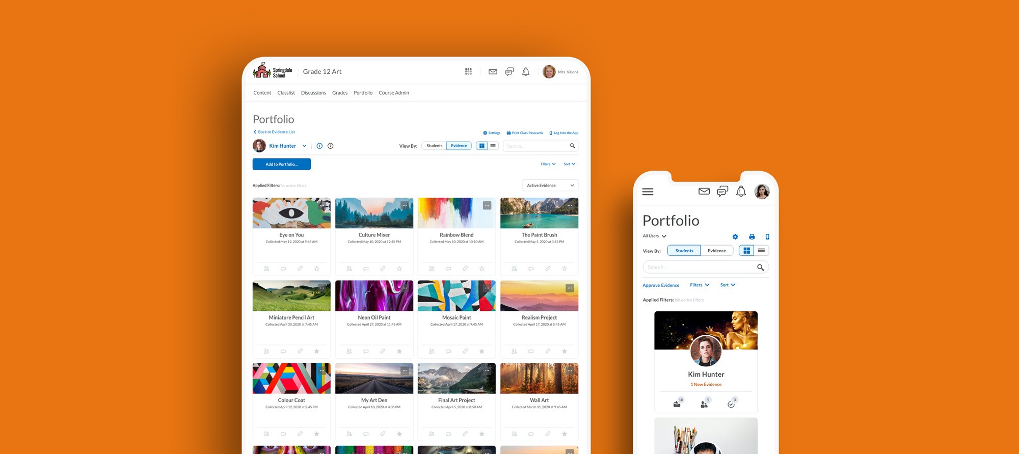
Centralized navigation
With my findings from the usability test, I met with the rest of my team and we decided to focus on the instructor flow first as they were currently the most prominent users of the product. To better improve their process, we came to a decision to create a central point where an instructor is able carry out multiple actions without having to be stuck in a particular view. To achieve this, I started working on components that will provide the user with an agile navigation structure.
With my findings from the usability test, I met with the rest of my team and we decided to focus on the instructor flow first as they were currently the most prominent users of the product. To better improve their process, we came to a decision to create a central point where an instructor is able carry out multiple actions without having to be stuck in a particular view. To achieve this, I started working on components that will provide the user with an agile navigation structure.

After defining the components to be used, I proceeded to design mockups with careful consideration of where each component should be placed in order to provide the user with a user-friendly navigation structure that was not overwhelming to view. Before general release, a limited number of clients had early access to the improved UI flow and expressed very positive feedback and excitement with a few changes. Feedback from the user testing were incorporated and the features were shipped to all clients.
After defining the components to be used, I proceeded to design mockups with careful consideration of where each component should be placed in order to provide the user with a user-friendly navigation structure that was not overwhelming to view. Before general release, a limited number of clients had early access to the improved UI flow and expressed very positive feedback and excitement with a few changes. Feedback from the user testing were incorporated and the features were shipped to all clients.
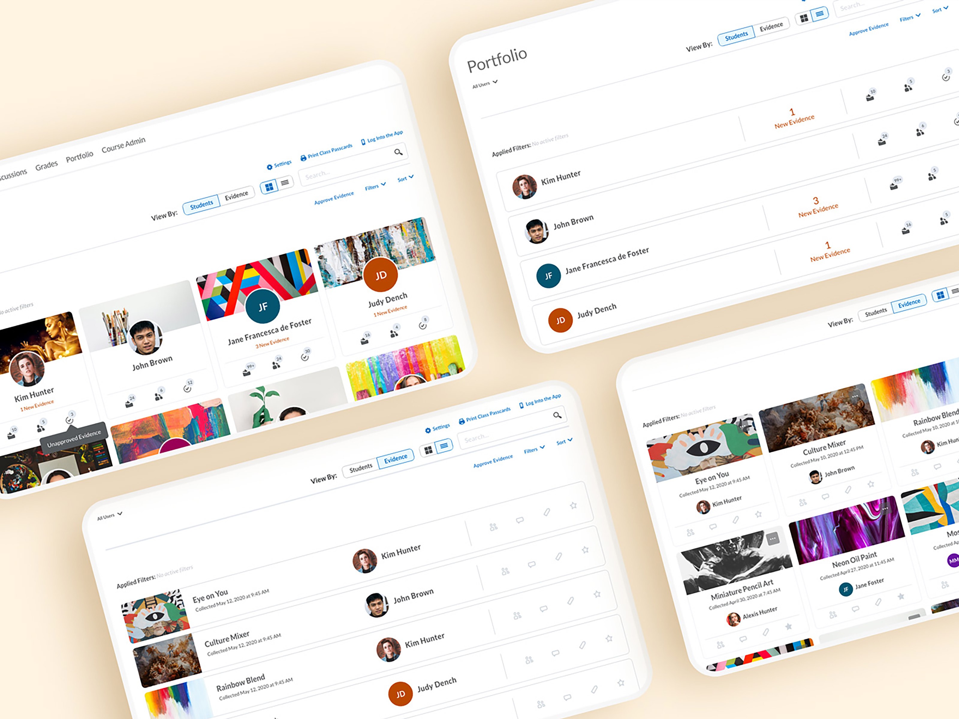

Building the learner space
After shipping the improvements made to the instructor navigation and user interface, the team was now focused on the next milestone; increasing higher education market adoption. To enable us properly understand the needs of the higher education learners, I collaborated with two researchers and we conducted a series of user interviews across multiple continents. After interviewing over 30 instructors and 40 learners, we were able to define the primary and secondary uses of portfolio in the higher education space. The first thing we realized while analyzing the data from the research was the fact that the current product was very instructor dependent. This was as a result of the fact that the product was originally built for the K-12 market. Using this data, I was able to define a learner focused user flow that met the requirements laid out by the learners and instructors during the research process. I proceeded to create a user persona after defining the learner-centric user flow. This helped me understand the possible ways the learners could possibly use their portfolios across their different courses.
After shipping the improvements made to the instructor navigation and user interface, the team was now focused on the next milestone; increasing higher education market adoption. To enable us properly understand the needs of the higher education learners, I collaborated with two researchers and we conducted a series of user interviews across multiple continents. After interviewing over 30 instructors and 40 learners, we were able to define the primary and secondary uses of portfolio in the higher education space. The first thing we realized while analyzing the data from the research was the fact that the current product was very instructor dependent. This was as a result of the fact that the product was originally built for the K-12 market. Using this data, I was able to define a learner focused user flow that met the requirements laid out by the learners and instructors during the research process. I proceeded to create a user persona after defining the learner-centric user flow. This helped me understand the possible ways the learners could possibly use their portfolios across their different courses.


Wireframing
Following the definition of the user flows above, I began working on wireframes using the components library created for the instructor flow with minor changes to fit the learners. This design system was then used to define the overall look and feel as well as the structure and placement of elements on the website. This helped us maintain a consistent overall feel to the design across both user views.
Following the definition of the user flows above, I began working on wireframes using the components library created for the instructor flow with minor changes to fit the learners. This design system was then used to define the overall look and feel as well as the structure and placement of elements on the website. This helped us maintain a consistent overall feel to the design across both user views.


Results
With the new enhancements to the overall experience of portfolio, there was an exponential rise in user adoption and transfer requests.
300%
300%
boost in overall user adoption across three segments
11
11
new Higher Ed and Corporate sign up withing first month
Like what you see? Drop me a line!
Thanks for taking the time to check out my portfolio. I'm more than happy to answer any questions or discuss new opportunities so feel free to reach out to me any time
Get in touch
Like what you see? Drop me a line!
Thanks for taking the time to check out my portfolio. I'm more than happy to answer any questions or discuss new opportunities so feel free to reach out to me any time
Get in touch
Like what you see? Drop me a line!
Thanks for taking the time to check out my portfolio. I'm more than happy to answer any questions or discuss new opportunities so feel free to reach out to me any time
Get in touch