Defining the project

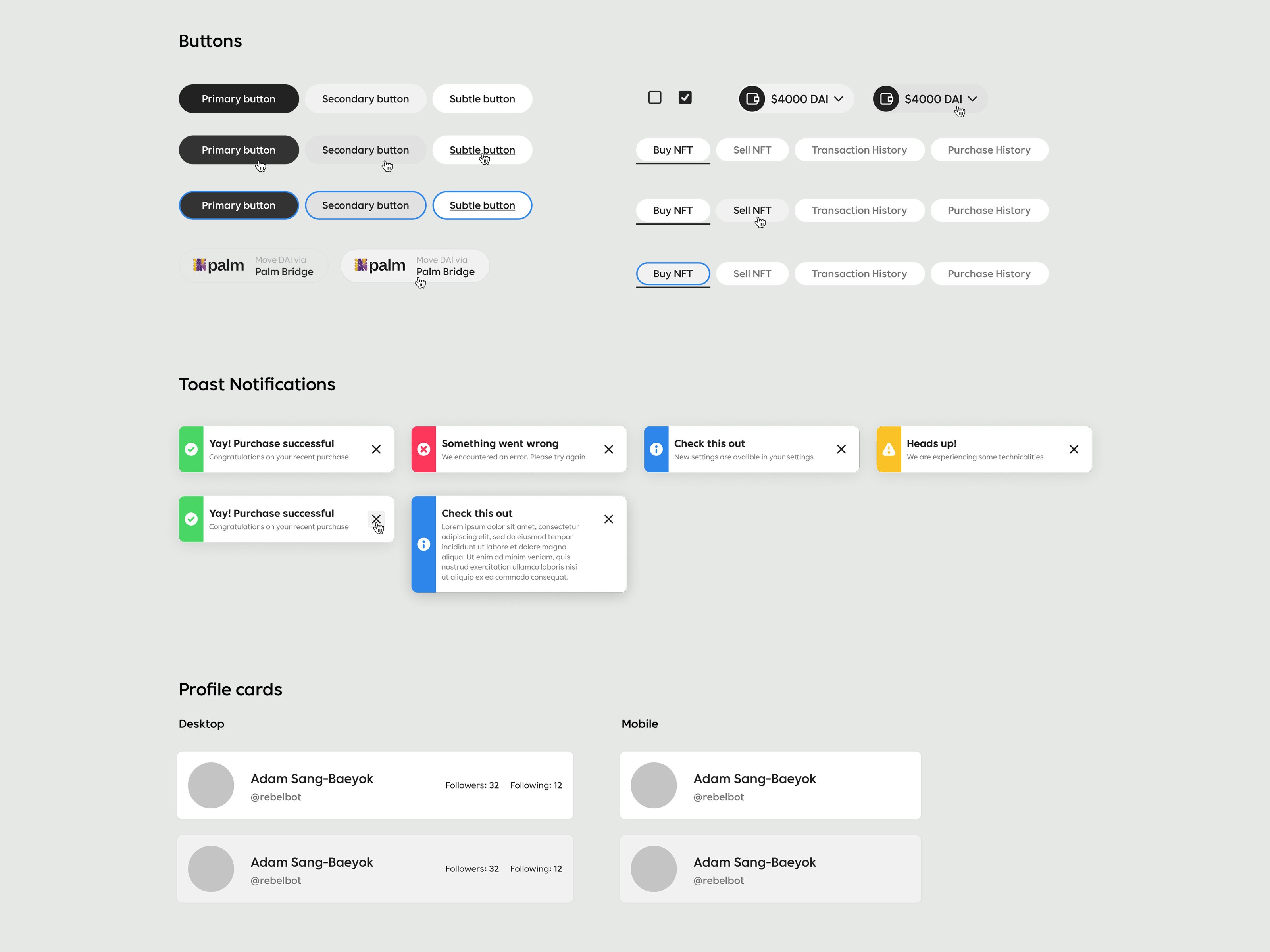
Design and implementation
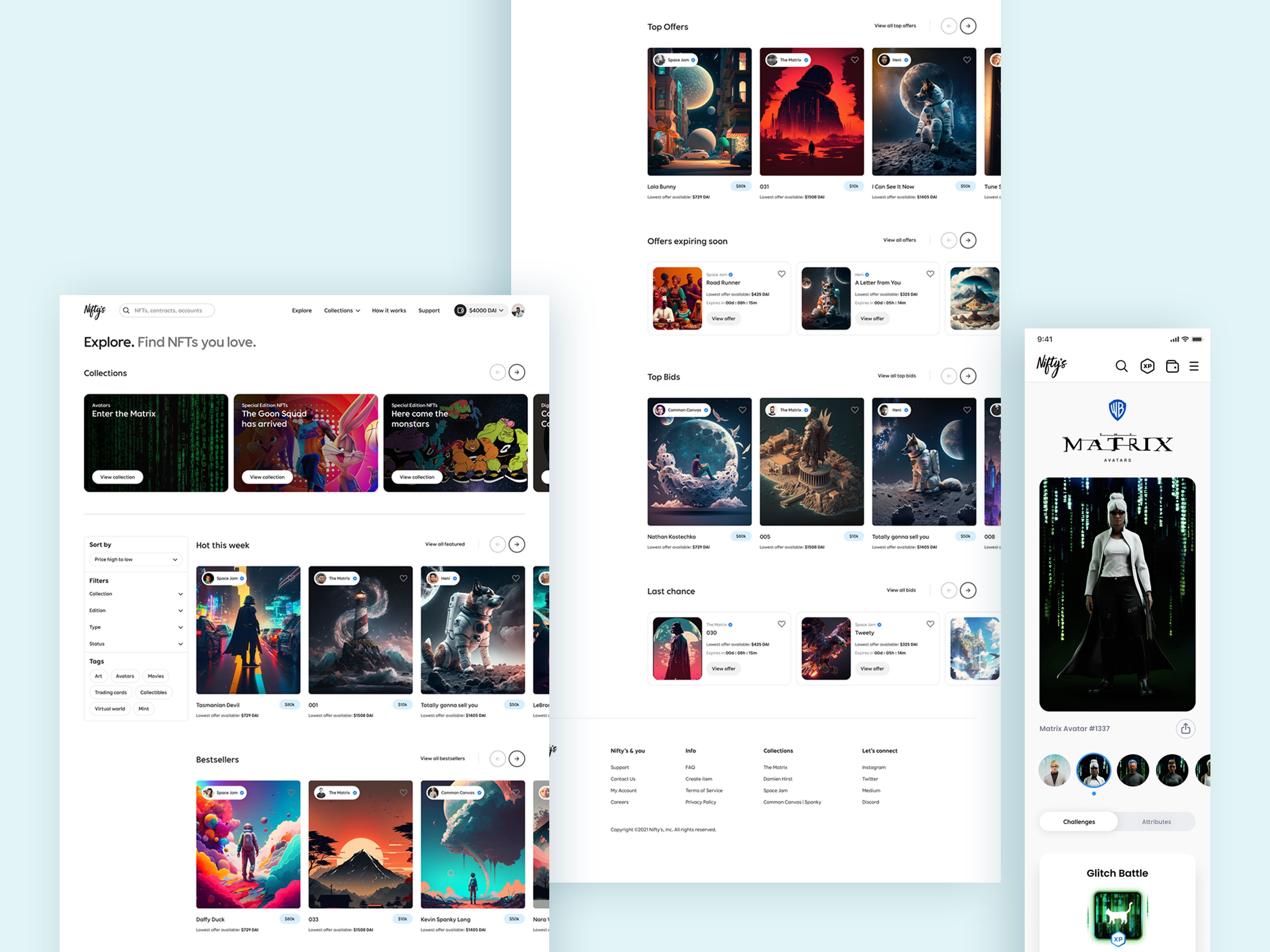
Explore marketplace


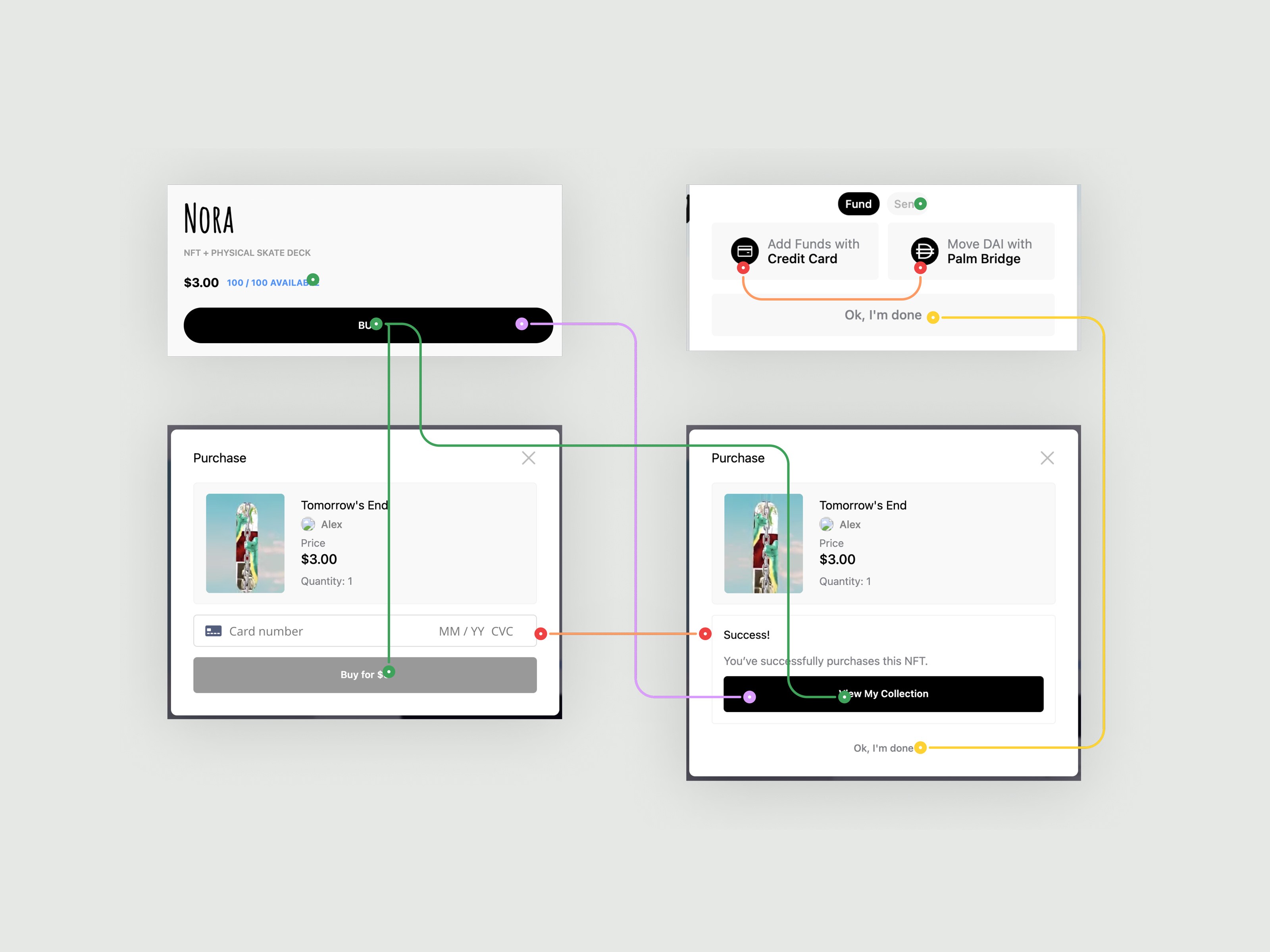
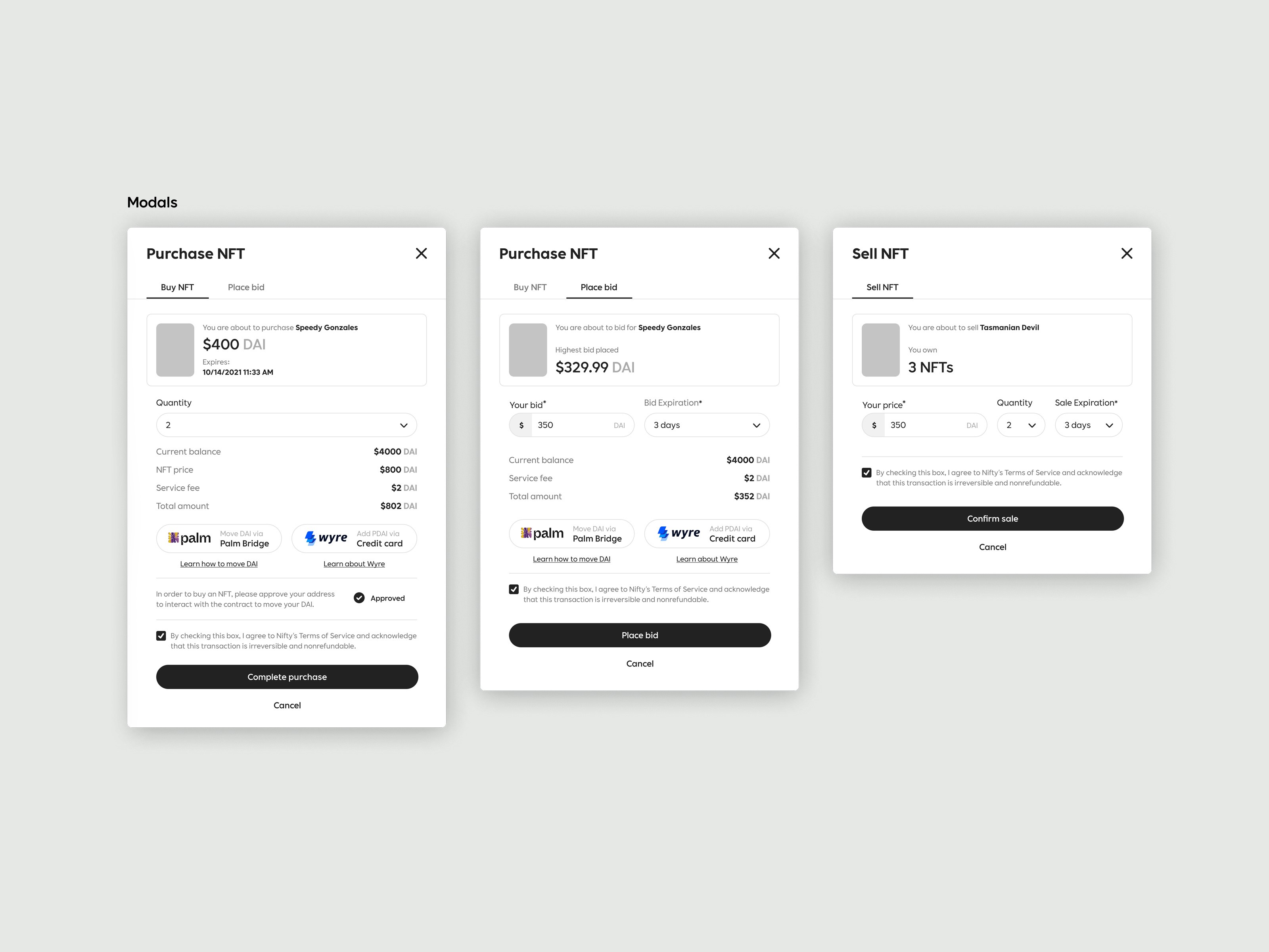
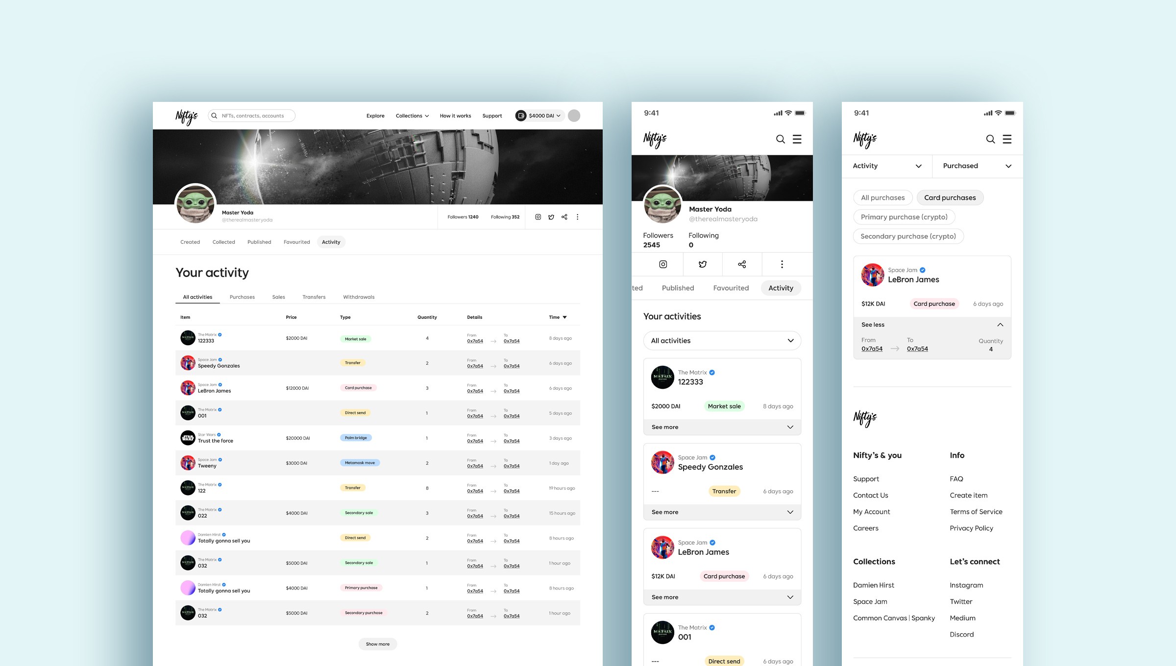
Buy and sell NFTs


Nifty's wallet

Nifty's Engage
Alongside Warner Bros' release of "The Matrix Resurrections," Nifty's launched an interactive engagement campaign in which users completed various missions to be rewarded with special NFTs. Although mobile-focused, I developed a complementary web experience that tracked missions, kept a running total of points, and presented user achievements. In order to enhance the overall experience and community interaction, an interactive leaderboard that presented all-time points earned and missions completed was created. The campaign included avatar-specific challenges, some requiring the user to offer high-value rewards in exchange for sacrificing avatars from their current holdings. I started by creating an immersive landing page that established the campaign tone and conveyed the mission framework clearly. Seeing that users would require insight into their progress, I incorporated progress indicators on the mission and challenges card so that participants could easily estimate their progress. With a vision to maintain the consistency across the platform, I made the page layout similar to our purchase and sell transaction pages so that the users can easily navigate a familiar experience. The mission dashboard that I created divided challenges into daily, weekly, and monthly segments associated with unique avatars, in addition to a clear indicator of the user's total experience points (EXP) earned from completed missions. With a goal to maintain consistency across the platform, I designed the page structure similar to the buy and sell transaction page. This would help users find it easier to navigate as they had experience something similar. One important note in the initial planning was that users who lacked Matrix avatars would be unable to participate in the campaign—potentially creating a barrier to entry. To address this, I made several conversion routes throughout the experience. This meant having a designated area directing users to the collection page and subtle but highly successful "Buy Now" buttons allowing seamless transition to "The Matrix" collection from numerous points throughout the experience. This user flow design ensured that even novice collectors could easily understand how to participate, with the gamified elements engaging expert collectors throughout the campaign. The design successfully balanced Warner Bros' brand requirements and best practice for user experience, achieving significantly higher engagement metrics than any other branded campaigns.


Results
With the UX enhancements made to the Nifty's site, the new experience was able to drive the below milestones for the company.
boost in overall user adoption across three segments
new Higher Ed and Corporate sign up withing first month
user increase during Nifty's engage